The Art and Theories of Joachim Kelz
Tuesday, 3 March 2009
Monday, 2 March 2009
Cornfield - Same brushes, stylized composition
This Photoshop painting was inspired by the Yosemite park. I used some of the brushes I created for the previous, more realistic painting and used them on a heavily stylized composition. Looking at the finished painting I think it's safe to say that various grades of stylization can be used within one image as long as they're consistant across the discipline.
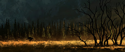
This painting was actually very satisfying for me since I reused all the brushes and managed to create a totally different landscape in a very short amount of time. I'm thinking of doing this again in an extremer way using highly detailed brushes on very abstract shapes. I'm just a bit unsure about the lighting style... in theory I'll be able to set the level of realism and detail of my lighting techniques totally independent from other components of the image.
We'll see...
We'll see...
Sunday, 14 December 2008
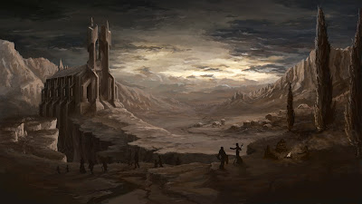
Cryosphere - Back To Photorealism
Abstraction is a process that requires thorough understanding of the source object in it's full visual, physical and emotional complexity. While successfull abstraction will intensify your image, a lack of understanding will result in weak, immature or unfinished looking images. Many artists will disagree with me when I say: The best way of finding your own style and focus is exposing yourself to the full complexity of your motive first. Then let your personality and technique decide which parts are relevant and which are not.
Having said that - I went back two steps and tried to get my next painting as close to reality as time and tools allowed. I created eight different Photoshop brushes and spent nine hours using them to create this image from scratch. I could have spent an infinite amount of time to improve it but I stopped once I had the feeling that I learned my lession. The problem is, I would now have to do a stylized version of this scenario to complete my training but I just can't be asked to do the same thing again. My next painting will be stylized but it will only have some elements of this landsacape.
Having said that - I went back two steps and tried to get my next painting as close to reality as time and tools allowed. I created eight different Photoshop brushes and spent nine hours using them to create this image from scratch. I could have spent an infinite amount of time to improve it but I stopped once I had the feeling that I learned my lession. The problem is, I would now have to do a stylized version of this scenario to complete my training but I just can't be asked to do the same thing again. My next painting will be stylized but it will only have some elements of this landsacape.
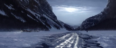
The image is called "Cryosphere" and was inspired by the ambient sounds of "Biosphere".
Saturday, 13 December 2008
A New Style
Of course this style is not new for everyone, it's just new for me. Looking at paintings, posted by some of my distant colleagues at Disney US, inspired me to buy an art book by Hans Bacher, one of the masters of Disney feature animation. The style, clarity, drama and unbelievable skill in every single of his brilliant works blew me away. It probably takes a lifetime of hard work to get there but looking at the results I thought it's worth starting the journey.
I sometimes spend too much time on images that in the end are just medium impressive. To improve the economy of this painting I cut down on less important details and used textured brushes to simulate suface structures. Hours later I found myself biting my fingernails, big wrinkles on my forehead and red eyes. How tough can it be...
Still... after about three hours of pain I ended the war and went to bed. A sober inspection the day after made me believe that I had actually made a step in the right direction and while being miles away from Hans Bacher's work I could still see the experiment as being slightly successful. What I have learned is that the more clear and minimalistic a painting is made the harder it is to hide behind your technique.
Sunday, 30 November 2008
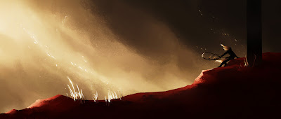
Blizzard Art Contest 2006
After what seems like a very long time of drawing and painting traditionally, I finally decided to enter the Blizzard Art Contest with a 2d digital painting. It all happened in summer 2006 while I was working on 3d characters for Konami for an unannounced project on XBOX 360 and Playstation 3. I felt like I needed a break from all the 3d tools and technical hassles that come with this task and instead enjoy the technical simplicity of painting an image using only one tool (Photoshop) and one technique - a standard round brush.
I came 4th and thought that was actually not bad, so I started to explore the possibilities of digital painting... and... will most likely continue to do so until the end of (my) time.
Subscribe to:
Posts (Atom)